Wednesday 26 January 2011

Type Box


This is a piece I designed in my own time. On the sides of the box It spells out the words 'Whats In The Box'.


The message was not the main part of this piece. The main reason I did this was to experiment with the use of light and shadow on type.

Tuesday 25 January 2011

Weird Science


Here are three double page spreads from my sketchbook for the 'Weird Science' brief.


For the 'Weird Science' project I created glasses that change what you see. My choice of the pop art style and bright colours was inspired by Tom Wessleman after viewing his exhibition.


I put my designs of the weird world onto a computer screen to see how it would look.

Sunday 23 January 2011

Promises Always Look Good On Paper


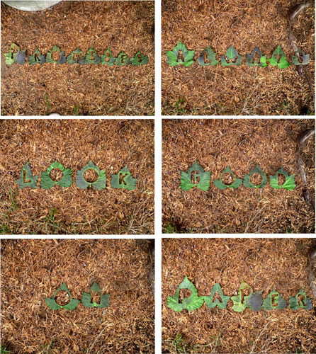
This was when I came up with putting type into leaves.


I cut the letters out of paper and got people to write down promises they have made or been told recently. On the paper I wrote all of them down so from a distance it looks like the veins of the leaves, but when you concentrate, you can see all the promises.


I wanted to put this in a fragile environment. This was to represent the fact that promises are not always kept.

Saturday 22 January 2011

Leger 'The Builders'


In small groups we created a 3D interpretation of Leger's piece, "The Builders".


I then did an individual interpretation of "The Builders". I decided to look more at the geometric shapes and patterns that were Leger's piece.

Friday 21 January 2011

3D Workshop


We were working from sketches we did before entering the workshop. This was from a still life drawing I did of cardboard boxes.


I decided to focus on the 'peas' from fir trees. I used many different methods of metal manipulation. My favourite was plenishing the metal with a round headed hammer to create the rough surface.

Thursday 20 January 2011

London Zoo


I Chose to visit London Zoo in my free time to get some sketches of the animals. These are my two favourite pages.


Wednesday 19 January 2011

Photo Stencil


After really enjoying working in the print room, I did this photo stencil. I chose to use this image as it was a photo I took when on holiday in Cornwall and I really liked the texture and feel of the piece.


After coming out with many practices of using different materials and colours I decided to use them and use the method of inter cutting the screen prints to create these pieces.

Tuesday 18 January 2011

WagWan


I wanted to design a poster and a booklet for a new furniture store called 'WagWan'. WagWan is an upmarket shop and does expensive items but will be set in 'urban' surroundings. For research I investigated places in London that I had not really looked at before that were known for having 'urban' features.